
I have referenced the concept of “personal vote” and “sophomore surge” quite a few times during this campaign, and in the past, but I thought it would be useful to actually collect data and analyse how much of an effect we can detect from the swings data.
But first I think I should explain the concept and theory of how a sophomore surge would be expected to work. The idea is that an MP has a personal vote – people who vote for them individually who may look elsewhere if that MP wasn’t on the ballot paper. While this personal vote may be stable or may grow or shrink over time, it is easiest to identify when they either arrive or depart. Also part of this idea is that being a sitting MP has a special status that it is hard for other candidates to achieve. They have a much higher local profile, the benefit of publicly-funded communications budgets and just have the ability to stick around attending events and being present in the community when other candidates have to go back to their job.
So if there is a personal vote for an MP, we would expect that to first appear when they first run for re-election after a term in office, and it would also be noticeable the first time they are not on the ballot paper after retiring or being defeated.
The retirement effect and the new-MP effect thus could be equivalent in power. And the effect could be doubled in the scenario where both effects apply. If a sitting MP were to lose their seat to an opposing MP, at the following election the new party would doubly benefit from a new personal vote and the absence of an old personal vote.
To keep things simple, I’ve used a system of scoring I first saw used by Peter Brent. Unfortunately I think that work is no longer online but he does touch on this topic in this 2014 piece.
A personal vote is worth one point. As long as it continues, it is worth the same. The more important number is the change in the personal vote score from one election to another. So if Labor has a sitting MP, that is +1 for Labor. If the Labor MP is defeated by a Coalition candidate, at the following election the seat would be +2 for the Coalition. If a sitting MP were to retire, that would be a -1 for that MP’s party, and would at the following election produce a score of +1 for the party of whoever ended up winning the seat. A seat where the incumbent has remained consistent has a score of 0.
The most obvious place where we can see the effect of sophomore surges is at elections where a party holds a lot of seats that they won off their opponents at the previous election. This is usually the case when a first-term government is facing election.
At the 1998 federal election, the Coalition government held rather a lot of marginal seats won off contesting Labor MPs in 1996. If you took the actual 2PP swing and applied it to the pendulum, you would have expected the Coalition to lose 30 seats, and thus lose government. Instead they lost just 18 seats, maintaining their majority and government despite losing the two-party-preferred vote.
At the 2010 election, the first-term Labor government actually lost twelve seats, but the pendulum would have predicted a loss of 18. They actually lost twelve seats, and just barely held on to government.
There are other examples in state politics. There’s always an explanation about how the successful party was just better at campaigning, but there never seems to be a good explanation for why their campaigning skills seemed so much better just at that specific election.
But this data isn’t detailed enough to be able to tell us if this is a real phenomenon. I wanted to collect a large amount of election results, assign a sophomore score (as I’ll call it from here on out) to each contest and then examine the relationship between that score and the 2PP swing.
There’s no reason to think this effect is only limited to major party contests. If anything it seems like the personal vote is a bigger factor for crossbench MPs. But there is vastly more data for major party contests, and it is simpler to just calculate the 2PP swing. In many non-classic seats the result is influenced by 3CP or primary vote calculations, and often a valid 2CP swing can’t be calculated.
I have calculated this data all the way back to the 1998 election. To calculate the change in the incumbency effect I needed to also include 1996 results, and I also wished to modify the sophomore scores to reflect redistribution changes. Because of this, I now possess a dataset of how many votes were transferred from one electorate to another at every federal redistribution since 1994. That may prove handy when we come to the next round of redistributions.
I have excluded non-classic contests, and I’ve also excluded any other cases where the sitting MP was a crossbencher (pretty much all of whom were those who had defected from a major party). For all others, they get a score ranging from -2 (Labor MP who defeated a Coalition MP) to +2 (Coalition MP who defeated a Labor MP), with 0 as the mid-point reflecting no change in the seat’s MP status. Redistributed seats could have a score anywhere on that spectrum.
To take one example, the South Australian seat of Spence was created in 2019. It primarily replaced the seat of Wakefield, which was held by Nick Champion. 74.8% of the voters in Spence came from Wakefield, so I gave Champion an existing incumbency score of 0.748. Champion retired in 2022, so Labor lost the benefit of his personal vote in the Wakefield part of Spence, but there had been no sitting Labor MP contesting Spence in the areas moved from Port Adelaide in 2022, so they did not lose that vote. So the score for Spence in 2022 was +0.748 for the Coalition. Champion’s personal vote was diminished in 2019 by the redistribution, so the Liberal Party gained less from his 2022 absence, in estimating how much the seat would swing.
This chart shows the 2PP swing, relative to the swing for that state, plotted against the sophomore score. This chart shows just over 1200 cases.
Of course a large number of seats get a score close to zero, but still there is a noticeable trend where seats around the -1 and -2 scores tend to produce smaller swings to the Coalition compared to those around +1 and +2.
Of course I am not arguing that this is the dominant factor in determining the size of swings in elections. Other factors are more significant, but I do think there is some evidence that the sophomore surge can skew trends one way or the other.
You can also see this if you round all sophomore scores to the nearest 0.5 and look at the average swing.
| Sophomore score | Average 2PP swing to LNP (adjusted to state) | # of seats |
| -2 | -0.91% | 37 |
| -1.5 | -2.25% | 16 |
| -1 | -1.07% | 153 |
| -0.5 | -0.21% | 61 |
| 0 | 0.08% | 688 |
| 0.5 | 0.91% | 61 |
| 1 | 0.86% | 135 |
| 1.5 | 1.89% | 20 |
| 2 | 1.52% | 51 |
- Seats with a score of zero average out to almost no swing variation, while seats with scores of 1.5-2 swing by over 1% more. Seats with a score of -1 or -2 swung by about 1% less than their state.
- The trend is also interesting when you break it down by each individual election – nine covered by my analysis. This chart isn’t interactive, but shows the same content as the above chart, broken up into the nine elections.
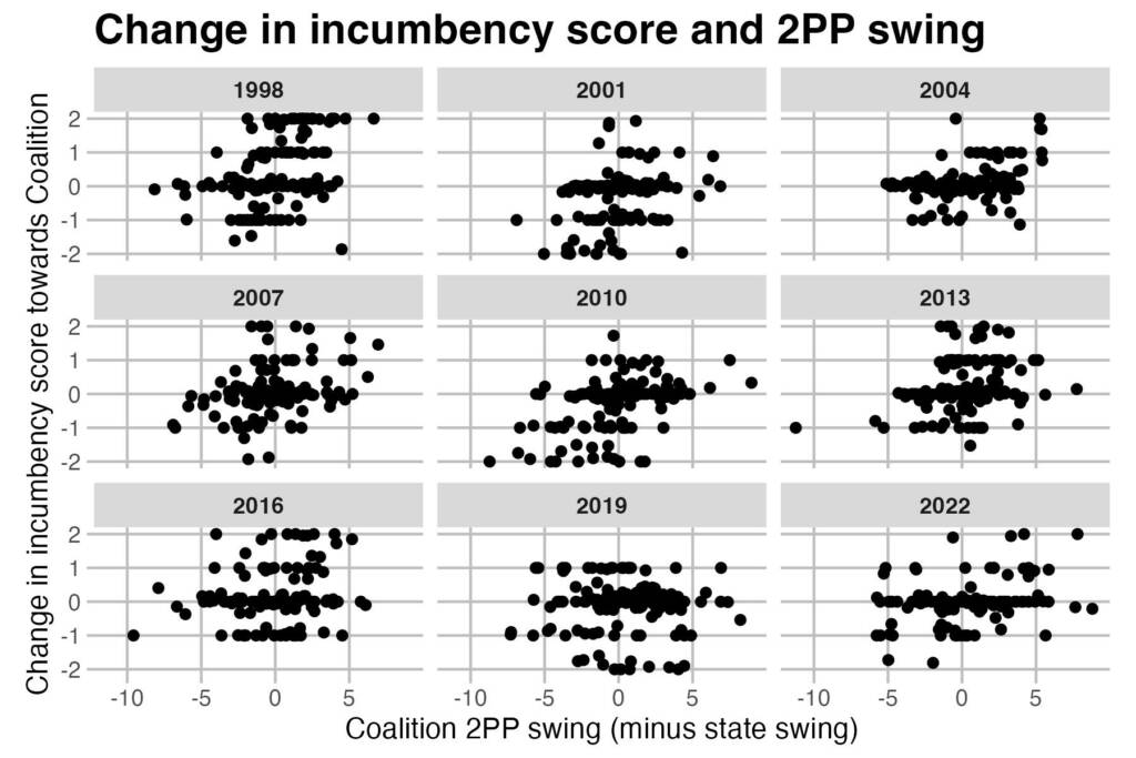
The trend is obvious for pretty much every election, with one exception. There didn’t appear to be any sophomore swing effect in 2019. The Coalition had no +2 seats that year. Labor did have quite a few seats with scores around -2, but none of them had relatively high swings for Labor.
I calculated correlations between the Coalition 2PP swing (state-adjusted) and the sophomore score at each election. The overall correlation was 0.257. The effect was strongest in 2010, with a correlation of 0.448. It was also quite high in 1998 and 2004. The effect was completely missing in 2019, and was very weak in 2016 – when the correlation was 0.167.
I did also investigate how relevant the redistributions were to these calculations. I ran the same calculations with all seats given a whole-number score that basically pretends that no boundary changes took place. It turns out it doesn’t make much difference to the estimates. They all end up being about the same. But I do think the redistribution-adjusted numbers provide more information about how a seat has been changed.
So for the next blog post I’m going to look at the sophomore scores for 2025, and which marginal seats may get a boost from changes in the personal vote. That post will be out tomorrow.

I am inspired to think about other possible measures. Naturally, when there is a redistribution an electorate will take in an adjacent area. So, does a sophomore effect apply. eg Mrs Smith wins the electorate of Howard for Labor. Next election, the electorate of Howard gets 4 polling booths from the seat of Rudd. Does the swing apply equally for the polling booths that were always in Howard compared to those that were in Rudd and now in Howard? I think there is a bit of data to work through there.
Didn’t Peter Brent do this sort of analysis some 10 years ago and developed some code to cope with it in predicting outcomes.
I use Peter’s code sometimes