In Monday’s blog post, I ran through the data on the rate at which election results come in on election night: the rate in each state, how timezones explain some of that variety, the national trend for the three kinds of votes counted on the night, and how this trend has changed over the last four elections.
In this post, I’m using this same dataset to look at how the vote for each of the parties on election night. How long does it take before the data becomes more accurate, and what bias is left at the end of the night, compared to the final results.
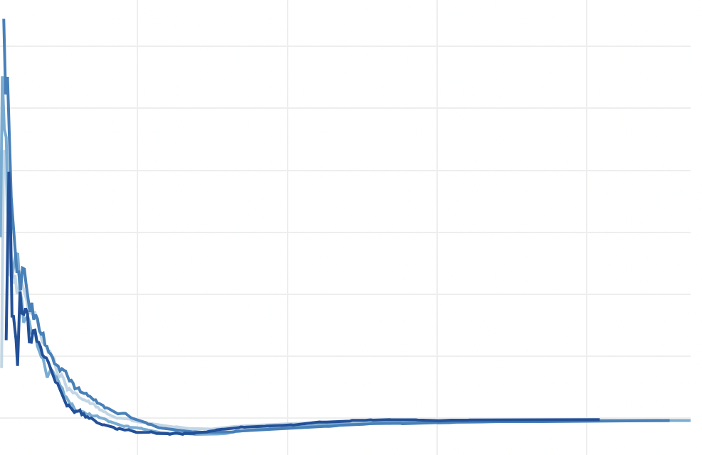
I’ve made three charts: for Labor, Coalition and Greens. For each chart, it shows the election night results for each party’s House primary vote on election night at the 2010, 2013, 2016 and 2019 federal elections. This chart is adjusted to show the results at any point in the night relative to the final vote count. So if the Greens ended up polling 11% nationally in the House, but at that moment they were polling 17%, that is registered as +6% on this chart.
I chose to use the House primary vote for a number of reasons. It’s the first data to be reported on the night. It’s also reported in every seat. Not every seat will report two-party-preferred votes, and two-candidate-preferred votes tend to be an arbitrary mix of parties depending on who appears to be in the top two, and can be withdrawn if the AEC changes its mind about who is in the top two. The House primary vote is far more universal and stable, and can be used to assess overall trends where preference counts don’t prove helpful.
Now it’s worth noting that while these trends are very similar, they may not be perfectly matched in 2022. The postal and pre-poll vote are expected to be bigger in 2022, which will slow down the count but could also potentially change how much they differ from the election day vote. Pre-poll votes are mostly reported later on election night, while postal votes are not reported at all on the night.
If you are conducting a full booth-matching election prediction operation, you can be more sophisticated and compare actual booths that have reported to their equivalent at the last election, and thus adjust for early biases without having to worry too much about the time. But for those of us who aren’t doing this, these time graphs can give us some sense of how much bias to expect in the early results, and when you can expect the results to stabilise at something close to the final outcome.
In short, the Coalition starts out with a much higher vote than they eventually receive, as small rural booths tends to be counted first. Labor’s vote tends to be lower than the eventual result, while the Greens also tend to be lower.
First up, the Coalition chart:
Results in the first half hour are very chaotic, and then between 6:30pm and 7pm the trend becomes more reliable, with the Coalition vote falling back to earth as the sample of results increases. By 7pm, the Coalition was outpolling their eventual primary vote by 1-4%.
By 8pm, the Coalition was actually underperforming their final result, ranging from 1.1% under in 2019, to just 0.19% under in 2016.
Coalition results between 8pm and 9pm assume a consistent trend, being about 1% below their final result by 9pm, then it creep closer to the final result.
When we shut up shop for the night, the Coalition is usually polling around 0.2-0.3% under their final result, with postal votes usually assisting the Coalition to slightly improve their position.
Next up, let’s take a look at Labor.
Labor’s chart is mostly the opposite of the Coalition. The vote tends to be very low in the first half hour (Labor was polling 23 points below the eventual result at about 6:15pm in 2016), but by 7pm Labor was polling about 2-4 points below their eventual result.
In a mirror image of the Coalition, Labor usually overtakes its final result around 7:45pm and doesn’t quite come back to earth by the end of the night. By about 2am (which is when my data starts to run out), Labor is pollling about 0.4-0.6 points above their eventual result.
Finally, the Greens.
Their early results are usually underestimating their eventual result, like with Labor, although around 6:15pm in 2019 they were massively overestimated. Their results get closer to the eventual outcome more quickly. By 7pm, their results were underperforming the eventual outcome by 0.5-0.75 percentage points. Unlike Labor, the Greens usually end the night underpolling, by about 0.2-0.3 points as of 2am.
Interestingly, the Greens primary vote in 2019 overperformed their eventual result from 7:30pm to 10pm, which had not happened at any of the previous elections.
That’s it for now. Hopefully these charts are interesting and can help you navigate those chaotic early hours on election night.


I am thinking two possible exceptions to the trend of smaller booths favouring the Coalition would be Casey and Richmond. In Casey, the small Dandenongs booth favour the progressives (ALP/Green) while the suburban booths are Liberal leaning. In 2019, early on it in the night seemed that Labor was going to win Casey but then suburban booths had a swing in the opposite direction. In Richmond, the small booths in Byron Shire such as Wilsons Creek are strongly progressive while Urban Tweed Heads booths are better for the Nats than the majority of the small rural booths which have alternative lifestyle communities.
Comments are closed.