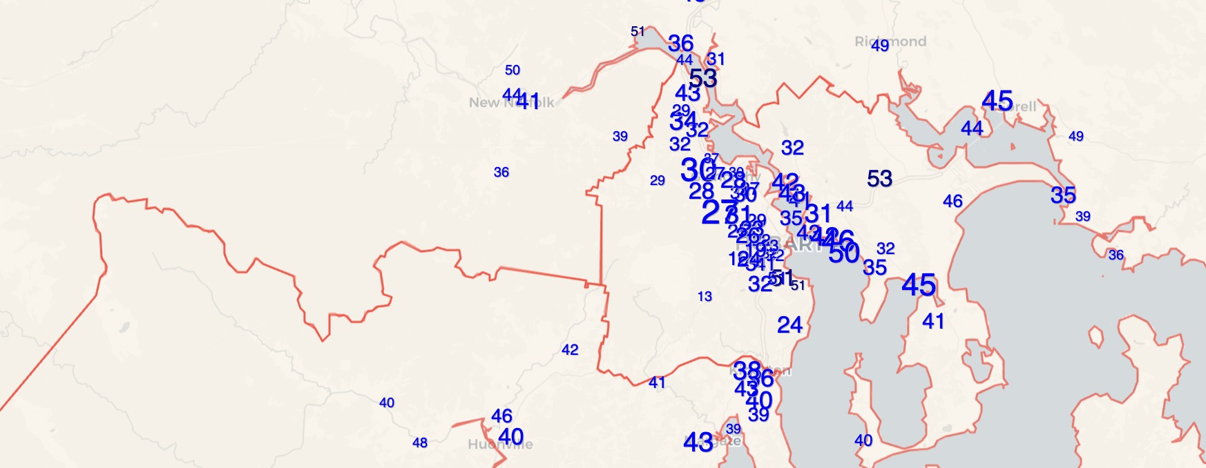
As promised, I have put together a map showing the vote at each election-day booth in Tasmania for the three major parties. Thanks to William Bowe’s Poll Bludger live results service for being the only place to publish full polling place results in an easy-to-access format, and Kester for finding the geodata.
I don’t necessarily have any particular insights about this map, but there’s a lot for you to scroll around and look at. I would note that the Liberal vote is much higher in the north of Lyons than in the south, which fits with the pattern we’ve seen in the other electorates, of the Liberal Party doing much better in the north than the south. This gap did already exist in the 2018 results. If anything the swing to the Liberals in the south was slightly bigger than in the north and centre of Lyons.
I was more interested in diving deep on Clark, by a long distance the most interesting race this year.
The following map is the same as the above, but just for Clark, and also includes the vote for independents Sue Hickey and Kristie Johnston.
It’s not surprising to find that Kristie Johnston’s vote is concentrated in the northern half of the electorate, which aligns with the Glenorchy local council where Johnston is mayor. Hickey’s support tends to be concentrated in the south of the electorate.
Another way to look at this variation is to break the electorate into the same sub-areas I used in my pre-election guide. From north to south the main areas are Claremont, Glenorchy, Hobart and South.
| Voter group | LIB % | ALP % | GRN % | Johnston | Hickey | Formal votes |
| Hobart | 24.8 | 20.2 | 29.8 | 10.2 | 8.9 | 14,154 |
| Glenorchy | 29.2 | 29.6 | 13.2 | 13.6 | 8.5 | 10,346 |
| South | 36.2 | 13.4 | 26.5 | 8.5 | 10.9 | 9,896 |
| Claremont | 34.3 | 29.8 | 8.3 | 13.6 | 7.5 | 6,593 |
| Other votes | 38.6 | 19.5 | 10.7 | 11.7 | 15.2 | 3,751 |
| Pre-poll | 33.6 | 21.1 | 18.3 | 12.2 | 11.4 | 9,334 |
Johnston’s vote is 13.6% in both Glenorchy and Claremont, compared to just 10% in central Hobart and just 8.5% in the south.
I also looked at the swings across each of these sub-areas for the three major parties. There wasn’t any big variation. The Liberal vote did drop the most in the north of the electorate, falling 7.4% in Glenorchy and 6.6% in Claremont, compared to just 4.1% in Hobart.
Labor’s worst swings were in Hobart (-22.6%) and the least bad in Claremont (-18.8%) but it was almost exactly the same in Glenorchy and the south.
The Greens swings varied between 2.8% in Claremont and 3.6% in the south, which isn’t much of a change.
That’s it for now. Check out the big map, and let me know in the comments what patterns you find interesting.


Crikey – that flannelette curtain is pretty visible isn’t it? Even more so in the ALP and Green votes than Johnston’s!
Isn’t it beyond time for Labor and the Greens to recognise if they were cooperating in coalition, they would easily defeat the regressive Lib/Nat bunch and we’d be able to start making some progress?
Comments are closed.