This is the latest in my occasional series looking back at the final results of the 2019 federal election.
The 2019 federal election was the second election held under the new Senate voting system, which included changes to make it easier to vote below-the-line. The election saw the rate of below-the-line voting increase nationally, with particularly large increases in New South Wales and the ACT.
I previously discussed the reasons for the big surge in New South Wales in June. Namely the spike in support for Liberal candidate Jim Molan. I’ll return to the ACT in a future post.
This chart shows the rate by state, and below the fold I’ll include the same information in a table.
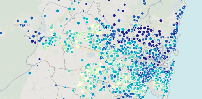
I’ve also included a map below the fold showing the below-the-line vote for every booth in the country.
| State | 2004 | 2007 | 2010 | 2013 | 2016 | 2019 |
| ACT | 20.9 | 17.2 | 24.1 | 19.9 | 15.2 | 22.4 |
| NSW | 2.4 | 1.8 | 2.2 | 2.1 | 5.4 | 6.8 |
| NT | 10.3 | 7.9 | 9.3 | 8.1 | 8.6 | 8.2 |
| QLD | 5.2 | 2.7 | 3.1 | 3.0 | 6.1 | 6.6 |
| SA | 5.9 | 6.8 | 5.9 | 6.5 | 8.5 | 7.3 |
| TAS | 18.8 | 15.8 | 20.2 | 10.3 | 28.1 | 27.1 |
| VIC | 2.3 | 2.0 | 3.0 | 2.7 | 5.3 | 5.6 |
| WA | 4.2 | 2.7 | 3.1 | 3.8 | 5.5 | 5.3 |
| Australia | 4.2 | 3.2 | 3.9 | 3.5 | 6.5 | 7.2 |
It’s interesting to look at which electorates had the biggest increase since 2016. It’s worth noting that I didn’t have the capacity to adjust the 2016 below-the-line rates for redistributions, but it’s not relevant for most of the top areas.
The two ACT electorates in 2016 both recorded just over 15% voting below the line. The three ACT seats recorded rates of 26.6% (Canberra), 19.9% (Fenner) and 20.8% (Bean), which makes Canberra the seat with the biggest increase, with Bean second and Fenner equal third with Tony Abbott’s electorate of Warringah.
The remaining seats in the top fifteen were the New South Wales seats of Mackellar, Cook, Berowra, Hume, Eden-Monaro, Bradfield, Hughes, Mitchell, Macquarie and North Sydney. With the exception of Eden-Monaro and Macquarie, they are all Liberal-held, and most are in three areas: northern Sydney, the Shire and south-eastern NSW. The Townsville-area electorate of Herbert was the only seat outside of the NSW or ACT to come in the top 18.
I haven’t been able to map out the change in below-the-line rates by booth, but the following map does show the overall rate in 2019. The top eight electorates are the eight seats in Tasmania and the ACT: the two jurisdictions were voters are required to choose between candidates in the state or territory assembly elections. The next-highest seats tend to be Liberal seats in northern Sydney (hello again, Jim Molan) or Greens-friendly inner-city electorates in Melbourne.
The map is colour-coded (darker blue means a higher below-the-line vote) with each dot sized according to the number of votes cast, but you can click on each booth to see the exact rate and the booth name.


Interested in your comments on the jump in the ACT below the line – there was certainly a strong push to ensure that the extreme right candidates didn’t get any oxygen – plus the effort to push the Green candidate ahead of Zed led to some ticket splitting
Ben
I am colour blind and the colours on your below the line tracking graph are unreadable. Even after consulting my wife we could not work out colours of lines. I think Tas and ACT were at top but this has more to do with knowledge than your graph.
However it is a pity mass media do not do all the hard work you are doing in analysing the AEC data.
Andrew, the same data is in the table below. Sorry that you can’t read it but you should be able to understand the trends from that table.
Comments are closed.