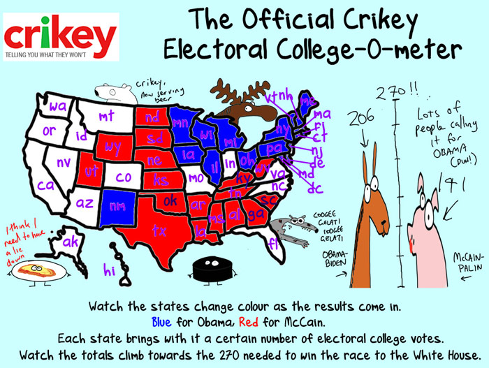
Via Crikey, Manhattan tech blogger Jason Kottke has posted a variety of different organisations’ maps used to display results in the US presidential election. They are all interesting to look at the different styles, but there’s two I wanted to post in particular, from Crikey and The Onion respectively.


That bottom one is definitely one of those ideas that you look at wish you’d had it first.
Comments are closed.